What we build
Frontend & Design
Responsive / Mobile-First Design
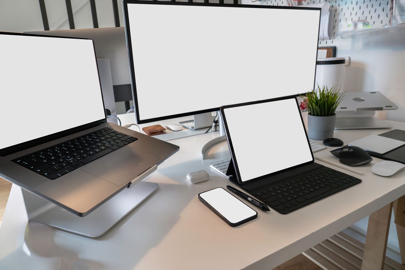
Layouts that adapt cleanly across desktop, tablet, and mobile.
Built mobile-first because that's where most traffic actually lands — layouts, touch targets, and performance budgets tuned for small screens first, then scaled up.
What we build
- Mobile-first layout system
- Touch-friendly interaction design
- Adaptive image & asset loading
- Cross-device QA testing
- Performance budgets per breakpoint
Optimizing tech
The tools we reach for most on responsive / mobile-first design projects — matched to your scale and budget, not sold as a package.
Tailwind CSSNext.jsFigmaBrowserStackLighthouse
Want this built for you?
Start a Project
Next Service